General
You can copy paste these code-snippits in your advanced theme settings. Follow these steps:
go to dashboard.ocularium.be
go to the menu ‘themes'
click on the second tab ‘advanced’
Paste the code snippit
Change the parameters and the ID.

You can find the correct ID’s by ‘inspecting’ the frontend. Follow these steps:
Open Xperify (or preview it)
Right-click on your page and choose ‘inspect’
The inspector window opens
Click on the button in the left corner
Hoover over the element of Xperify that you want to change
You can find now in the elements page of your inspector window the correct ID. Mostly mentioned as:
.page.page--XXXX
.page--XXXX module XXX
.page-module
In the right colom ‘styles’ you can find the same or other advanced code-snippits.
Code snippets
CSS Variables
CSS Variables can be used to insert the value of a custom property. You can use these anywhere in your custom styling. Some examples:
:root {
    // margin between items in digital labels (use at own discretion)
    --margin-dl-items: 30px;
    --dynamic-margin-dl-items: 30px;

    //
    --blue: #004FA3;
    --pink: #E4017E;
    --green: #124F3E;
    --grey: #D4D4D5;
    --lightgrey: #F4F4F4;
}
Base Color
In Themes it is possible to use a Base Color. We made it very easy to access that colour in your custom CSS. Some examples below:
.selector {
  color: var(--c-accent);
  background-color: var(--green);
  border-color: var(--pink);
}
Base Color - Blend
Besides the Base Color variable, it is possible to use the variable --c-accent-blend. This color is based on the Base Color and is an 'inverse' color.
When your Base Color is a darker color, the blend will show white.
When your Base Color is a lighter color, the blend will show black.
See the example below.
.selector {
  fill: var(--c-accent-blend);
}
Other variables
:root {
  --margin-dl-items: 42px; // change the spacing between
  --dynamic-margin-dl-items: 42px;
}
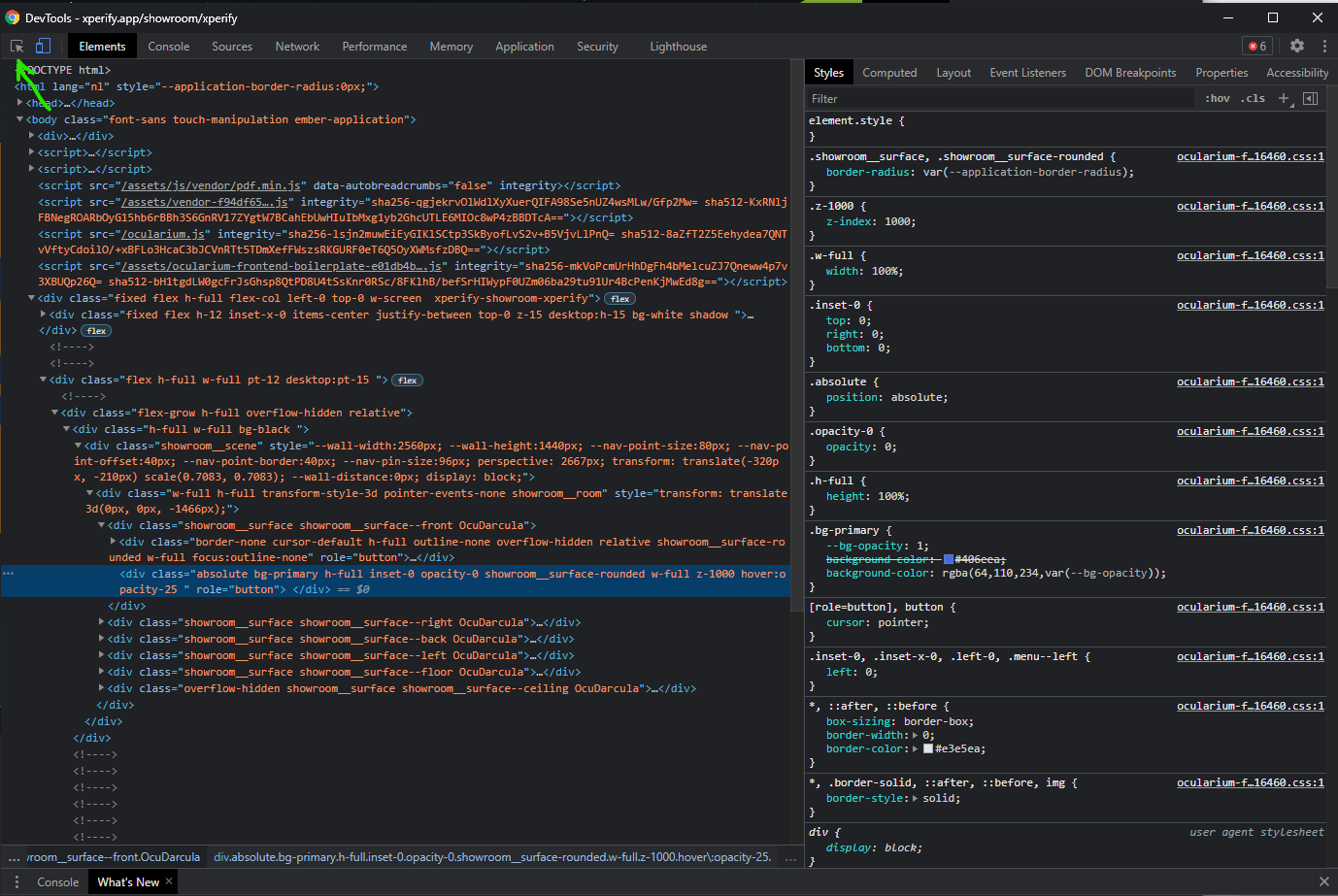
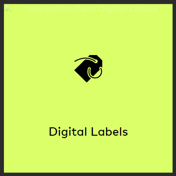
We made a variable for the margin between grid items in the Digital Label module.
Before:
After:
Navigation page - Mediabrowser tiles
Remove icon from menu item
.gridItem__icon {
    display:none;
}
Remove colored overlay from menu item
.gridItem__image {
    opacity: 1;
}
Change border-radius menu
.OcuDarcula .gridItem, .OcuLight .gridItem,
.OcuDarcula .gridItem__image, .OcuLight .gridItem__image {
    border-radius: 2%;
}
Remove the Basecolor background
.gridItem {
  background: none | white;
}
Change the background to a color
.gridItem  {
    background: #E7EAED;
}

/* change the background for a specific item */
.gridItem:nth-child(2) {
    background: red;
}
Change the background to an image
Use the module ‘asset bundle’ if you want to upload your images in Ocularium: https://ocular.atlassian.net/l/c/ymc8q9Xg.gridItem { background-image: url("https://via.placeholder.com/400"); background-size: contain; background-position: center center; } .gridItem__image { display: none; } /* change the background for a specific item */ .gridItem:nth-child(2) { background-image: url("https://via.placeholder.com/400"); background-size: contain; background-position: center center; } .gridItem__image { display: none; }Adjust the background color of a menu title
.gridItem__title p {
    background-color: #3C9B28;
    // add more options here
}
Place the title under the image
// add some margin
.gridItem {
  margin: 3em 2em;
}
.gridItem__title {
    height: 10;
    bottom: -10%;
    // add more options like...
    font-weight: bold;
    color: black;
    white-space: normal;
}

// align text to top line
.gridItem__title p {
    top: 0;
    transform: translateX(-50%);
}
Menu
Change the color of the Application title
.menu__title {
    color: #224190;
}
Change the color of the button icons (back arrow, home button, etc)
.menu__button {
    fill: red;
}
Change the color of the Breadcrumb border
ul.menu__breadcrumbs li .menu__breadcrumb__item__label {
    border-color: red;
}
File Cards
Change the border-radius of a file card
.OcuDarcula .card__wrapper,
.OcuLight .card__wrapper {
  border-radius: 0px;
}
Change a corner of a file card
.OcuDarcula .card__wrapper,
.OcuLight .card__wrapper {
  border-top-left-radius:     5px;
  border-top-right-radius:    10px;
  border-bottom-right-radius: 0px;
  border-bottom-left-radius:  5px;
}
Change the background color of a file card
.OcuDarcula .card__wrapper,
.OcuLight .card__wrapper {
  background: red;
}
Remove the title of a file card
.card .card__header__title {
  display: none;
}
Remove the line under the title of a file card
.card .card__body__tabs__title {
  border: none;
}
Remove the tabs when there’s only one tab present
.card__body__tabs__title:first-child:nth-last-child(1) {
    display: none;
}
Enlarging an asset to half the size of a file card (TEMPLATE)
.OcuDarcula .page.page--dl .dl__card,
.OcuLight .page.page--dl .dl__card {
    background: rgba(10, 25, 64, 0.36);
}
.OcuDarcula .card .card__wrapper,
.OcuLight .card .card__wrapper {
    width: 87%;
    height: 82.4%;
    border-radius: 0;
    padding: 1.5% 3%;
}
.card .card__body {
    height: 82%;
}
.card__close {
    z-index: 2;
}
.card .card__wrapper .card__header {
    position: absolute;
    width: 45%;
}
.card .card__wrapper .card__header .card__header__title {
    text-align: left;
}
.card .card__header__sub {
    text-align: left;
}

.card .card__wrapper .card__body__tabs {
    position: absolute;
    width: 45%;
    top: 20%;
}
.card__wrapper .card__body__tabs .card__body__tabs {
    border-bottom: none;
}
.card__wrapper .card__body__content {
    width: 100%;
    height: 100%;
    margin-top: 12%;
    padding: 4% 0;
}

.card .card__body__content__container {
    margin: 1% 0;
}
.card__wrapper .card__body__content .card__body__content__container__text {
    width: 96%;
    font-size: 1em;
}
.card__wrapper .card__body__content .card__body__content__media {
    position: absolute;
    top: 0;
    left: initial;
    right: 0;
    width: 50%;
    transform: none;
    background: lightgray;
    margin: 0 0;
}
.card__body__content__media .media .media__element{
    object-fit:cover;
}

.card__body__content__media .media__enlarge.button {
    left: 2%;
    right: initial;
}
Add styling to a specific file card based on its ID
.card--4 {
  // add styling here
}
Change the font of the body text
/* create a font-family */
@font-face {
    font-family: "myCustomFont";
    src: url('url-to-font.otf');
}

.card__body__content__container__text  {
  font-family: "myCustomFont";
  font-size: 42px;
  color: red;
}
Change the font of the title
/* create a font-family */
@font-face {
    font-family: "myCustomFont";
    src: url('url-to-font.otf');
}

.card .card__wrapper .card__header .card__header__title {
  font-family: "myCustomFont";
  font-size: 42px;
  color: red;
}
Pages and backgrounds
%20(6).png?version=1&modificationDate=1623224954435&cacheVersion=1&api=v2&width=340&height=191)
Add a background image to a navigation page
Use the module ‘asset bundle’ if you want to upload your images in Ocularium: https://ocular.atlassian.net/l/c/ymc8q9Xg
// replace '1234' with the correct id (as seen in Developer Tools)
.page--nav--1234 {
  background-image: url("https://via.placeholder.com/1920x1080");
  background-repeat: no-repeat;
  background-size: contain;
  background-position: center center;
}
2. Add a background to a module
// replace '1234' with the correct id (as seen in Developer Tools)
.page--1234 {
  background-image: url("https://via.placeholder.com/1920x1080");
  background-repeat: no-repeat;
  background-size: contain;
  background-position: center center;
}
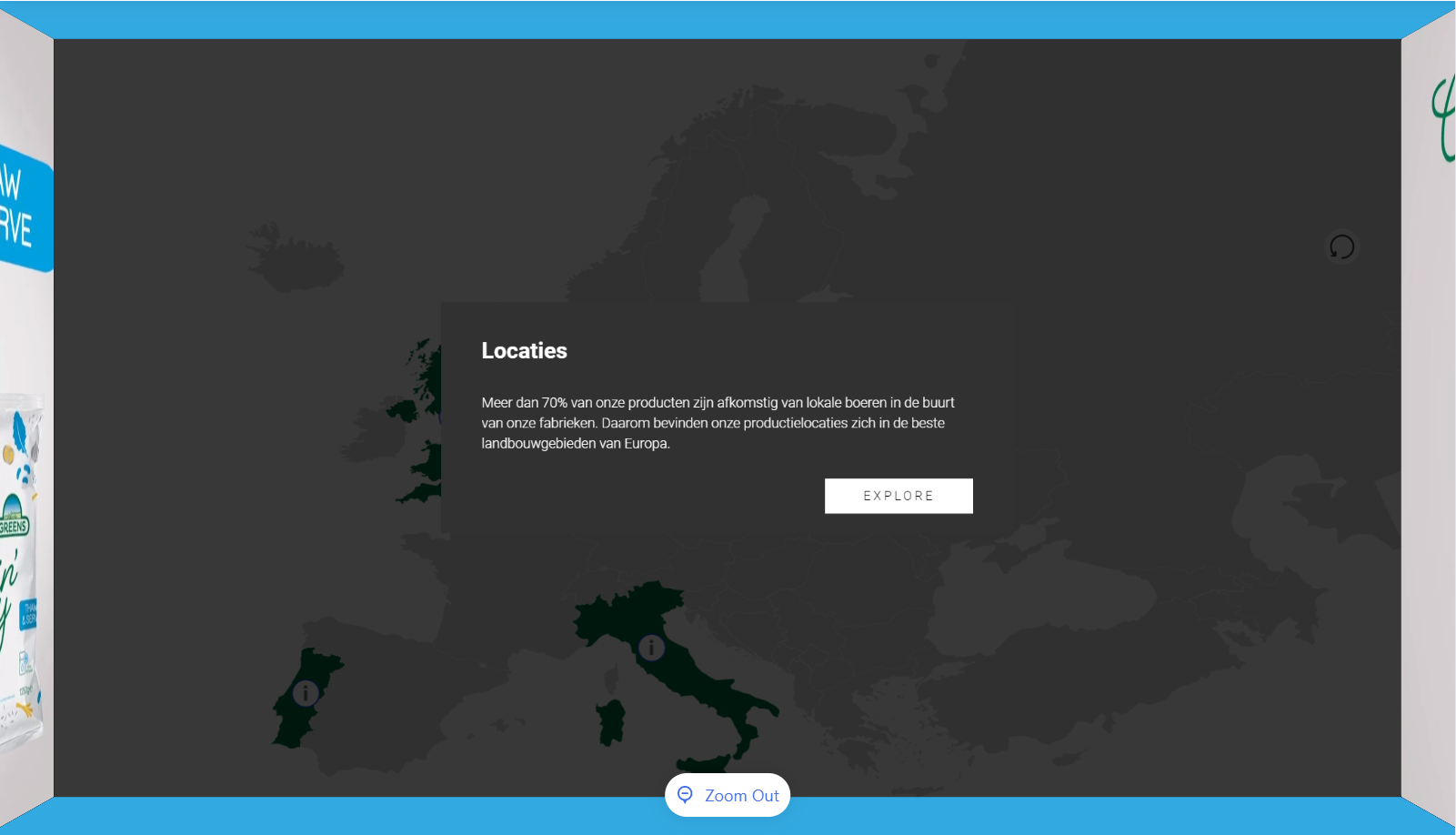
Interactive map / 3D interactive map
Hide the categories at the top
.im__filters__categories {
  display: none;
}
Hide the '? - info' button
.im__button.im__button--info {
    display: none;
}
Popups interactive map
Straighten the corners of a custom card
.OcuDarcula .page.page--im .pointerPopup,
.OcuLight .page.page--im .pointerPopup {
  border-radius: 0px
}
Remove the ‘pin - reset popup’ symbol
.pointerPopup__header__button.pointerPopup__header__button--reset.button {
    display: none;
}
Remove the line (divider) under the text and above the image
.divider {
  display: none;
}
Remove the thick line under the title
.pointerPopup__content .pointerPopup__content__tabs .pointerPopup__content__tab {
    border: none;
}
Change the color of the thick line under the title
.pointerPopup__content .pointerPopup__content__tabs .pointerPopup__content__tab.pointerPopup__content__tab--active {
    border-color: green;
}
Change the color of the icons in the header (reset, close)
// in this case we specifically change it for the close button
.OcuLight .page.page--im .pointerPopup .pointerPopup__header__button--close {
  fill: red;
}
Digital label
Straight corners for digital label
.OcuLight .page.page--dl .dl__grid__item,
.OcuLight .page.page--dl .dl__grid__item__face {
  border-radius: 0px;
}
Remove shadow around corners of a digital label
.dl__grid__item__face__image,
.OcuLight .page.page--dl .dl__grid__item__face,
.OcuLight .button.dl__grid__item__open {
    border-radius: 0px;
}
Change the ‘visited’ state of items. A value between 0 and 1
.dl__grid__item--visited .dl__grid__item__face--front,
.dl__grid__item--visited .dl__grid__item__face__image,
.dl__grid__item--visited .dl__grid__item__face__image img {
    opacity: .75;
}
Add a border to items in a digital label
.dl__grid__item {
    border: 5px solid red;
}
Media browser
Remove round corners for media browser items
.OcuLight .gridItem__image,
.OcuLight .gridItem,
.OcuDarcula .gridItem__image,
.OcuDarcula .gridItem {
    border-radius: 0px;
}
Screensaver
Delete the opacity of a screensaver overlay
.ss__background__overlay {
    display:none;
}
Adjust the opacity of a screensaver overlay
.ss__background__overlay {
    opacity: .3; /* with this you set the transparency of the layer in screensaver */
}
Module introduction
Straight corners
.OcuDarcula .alert__wrapper, .OcuDarcula .card__wrapper,
.OcuLight .alert__wrapper, .OcuLight .card__wrapper {
  border-radius: 0px;
}
Straight corners the button
.OcuLight .button.dl__alert__close {
  border-radius: 0px
}
Change the background color
.OcuDarcula .alert__wrapper, .OcuDarcula .card__wrapper,
.OcuLight .alert__wrapper, .OcuDarcula .card__wrapper {
  background-color: red;
}
Object Recognition
Change the default color of the arcs of a tag
// default arc color for clickable items
.or__tag__button .or__tag__button__arc {
    fill: var(--color1);
}

// default color for non-clickable arcs
.or__tag__button.or__tag__button--empty .or__tag__button__arc {
    fill: var(--color2);
}